


 22")


 34")


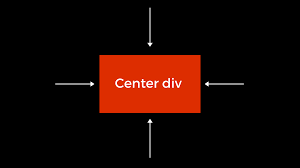
Centering a div element horizontally is one of the most basic yet essential tasks in web development. Whether you’re designing a login form, modal, or a simple button, achieving proper alignment ensures your layout looks clean and professional. Fsiblog guide explores various ways to horizontally center a div using CSS. Each method is beginner-friendly, with clear explanations and practical examples.
Why Centering Matters in Web Design
Proper alignment of elements creates a visually harmonious design and enhances the user experience. Centering is particularly important in:
- Minimalist Designs: Where few elements dominate the screen.
- Forms and Modals: To draw user attention to specific components.
- Responsive Designs: To ensure content is well-positioned on all devices.
With CSS, centering elements can be accomplished in multiple ways, depending on your use case and layout structure. Let’s explore these methods step by step.
Methods to Horizontally Center a div Using CSS
1. Using the text-align Property
The text-align property is an easy way to center a div horizontally when it’s wrapped in a parent container.
Code Example:
<!DOCTYPE html>

<html lang="en">

<head>

<meta charset="UTF-8">

<meta name="viewport" content="width=device-width, initial-scale=1.0">

<title>Text Align Center</title>

<style>

.parent {

text-align: center;

border: 1px solid black;

}

.child {

display: inline-block;

width: 200px;

height: 100px;

background-color: lightblue;

}

</style>

</head>

<body>

<div class="parent">

<div class="child">Centered Div</div>

</div>

</body>

</html>
Explanation:
text-align: center;: Aligns all inline andinline-blockelements horizontally within the parent container.display: inline-block;: Ensures thedivbehaves as an inline element.
2. Using margin: auto
This is one of the simplest and most widely used methods for centering a div.
Code Example:
<!DOCTYPE html>

<html lang="en">

<head>

<meta charset="UTF-8">

<meta name="viewport" content="width=device-width, initial-scale=1.0">

<title>Margin Auto</title>

<style>

.child {

width: 200px;

height: 100px;

margin: 0 auto;

background-color: lightgreen;

}

</style>

</head>

<body>

<div class="child">Centered Div</div>

</body>

</html>
Explanation:
margin: 0 auto;: Automatically adjusts the left and right margins to center thediv.- Requires Width: The
divmust have a defined width for this method to work.
3. Using position and transform
Combining position and transform is a versatile approach to centering elements within a container.
Code Example:
<!DOCTYPE html>

<html lang="en">

<head>

<meta charset="UTF-8">

<meta name="viewport" content="width=device-width, initial-scale=1.0">

<title>Position and Transform</title>

<style>

.parent {

position: relative;

height: 300px;

border: 1px solid black;

}

.child {

position: absolute;

left: 50%;

transform: translateX(-50%);

width: 200px;

height: 100px;

background-color: pink;

}

</style>

</head>

<body>

<div class="parent">

<div class="child">Centered Div</div>

</div>

</body>

</html>
Explanation:
left: 50%;: Moves thediv50% of the parent’s width from the left edge.transform: translateX(-50%);: Shifts thedivback by half of its own width.
4. Using CSS Flexbox
Flexbox is a modern and highly efficient CSS layout technology.
Code Example:
<!DOCTYPE html>

<html lang="en">

<head>

<meta charset="UTF-8">

<meta name="viewport" content="width=device-width, initial-scale=1.0">

<title>Flexbox Centering</title>

<style>

.parent {

display: flex;

justify-content: center;

height: 300px;

border: 1px solid black;

}

.child {

width: 200px;

height: 100px;

background-color: lightcoral;

}

</style>

</head>

<body>

<div class="parent">

<div class="child">Centered Div</div>

</div>

</body>

</html>
Explanation:
display: flex;: Enables Flexbox layout.justify-content: center;: Centers elements horizontally within the container.
5. Using CSS Grid
CSS Grid is another modern layout technique that simplifies centering tasks.
Code Example:
<!DOCTYPE html>

<html lang="en">

<head>

<meta charset="UTF-8">

<meta name="viewport" content="width=device-width, initial-scale=1.0">

<title>Grid Centering</title>

<style>

.parent {

display: grid;

place-items: center;

height: 300px;

border: 1px solid black;

}

.child {

width: 200px;

height: 100px;

background-color: lightyellow;

}

</style>

</head>

<body>

<div class="parent">

<div class="child">Centered Div</div>

</div>

</body>

</html>
Explanation:
display: grid;: Enables Grid layout for the parent container.place-items: center;: Centers thedivboth horizontally and vertically.
Comparing Methods
| Method | Pros | Cons |
|---|---|---|
text-align |
Simple for inline/inline-block items. | Requires inline-block for block elements. |
margin: auto |
Easy to implement. | Requires a fixed width for the div. |
position + transform |
Works for any layout. | Requires more CSS properties. |
| Flexbox | Flexible and modern. | Not supported in older browsers. |
| Grid | Simplest for centering both ways. | Overkill for simple layouts. |
Common Mistakes and How to Avoid Them
1. Forgetting the Parent Context
Methods like text-align and Flexbox depend on the parent container. Ensure the parent is styled correctly.
2. Not Defining a Width
Techniques like margin: auto require a defined width for the div to work properly.
3. Using Outdated Methods
Avoid older techniques like using tables for layout. Modern CSS methods like Flexbox and Grid are more efficient and maintainable.
When to Use Each Method
- Simple Layouts: Use
text-alignormargin: auto. - Responsive Designs: Opt for Flexbox or Grid for greater flexibility.
- Dynamic Elements: Use
positionandtransformfor modals and overlays.
Conclusion
Centering a div horizontally is a fundamental CSS skill every web developer should master. From basic properties like text-align to advanced techniques like Flexbox and Grid, there are multiple ways to achieve horizontal centering, each tailored to specific use cases.
By practicing these methods and experimenting with real-world layouts, you’ll gain the confidence to create visually appealing and user-friendly designs.


